
The news shared by Google last week came as no surprise to those who have been paying attention: The search engine goliath now officially receives more searches from mobile devices than desktop computers.
This continues an ongoing trend of growing mobile usage in comparison to traditional PCs. Simply take a look at the graph below from ComScore for a visualization of the overall picture:
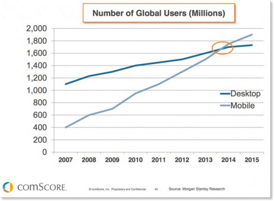
Between smartphones, tablets and other handheld devices, the Web is increasingly transforming into a mobile-first environment. Marketers and businesses must adapt or be left behind. Not only are mobile users becoming more and more prevalent, they also convert: studies show that 70 percent of mobile searches lead to action on websites within one hour. Additionally, Google now penalizes sites that are not mobile-friendly in its result rankings.
With these facts in mind, it should be clear that your digital strategy planning needs to prioritize mobile initiatives. Here are three steps you can take to ensure that you’re well positioned for the present and future:
1. Make sure your website has a responsive design.
This has become less of a luxury and more of an outright necessity. Responsive design means that your site is mobile-friendly, and will dynamically resize to display properly on the user’s screen, be it a phone, tablet or PC monitor. Web pages that lack a responsive design can be extremely difficult to navigate from a mobile device, and they don’t give the impression that the represented business is up with the times.
 2. Create a mobile app.
It’s not a fit for every company or industry, but mobile apps can be a great way to connect with customers directly and engage them on a new level entirely. Last year Forbes published a list of seven reasons that businesses of all sizes and types should have their own mobile apps, with benefits ranging from visibility to engagement to loyalty and more. Once upon a time, building a mobile app was a daunting task requiring substantial investment of resources, but today the barriers of entry are lower than ever.
3. Ensure that your funnel is clean and simplified.
Whatever action that you desire users to carry out on your website — be it completing a purchase in the case of an ecommerce site, or simply filling out a contact form — make sure that it’s extremely easy to do so on a mobile device. You’ll want a call-to-action that is immediately visible when they first reach the home page, and a process that is straightforward with minimal clutter. Remember that multimedia such as images and videos can cause pages to load even slower on mobile devices than on desktops.
Want some help adapting your mobile strategy? Tell us about your company and your website, and our experts would be happy to share some thoughts and insights.